Skip to content
The notch

How app developers and designers feel about the iPhone X—and the notch

iPhone app and game devs assess the iPhone X and share experiences with it.

Samuel Axon | 269
Credit: Apple
Credit: Apple

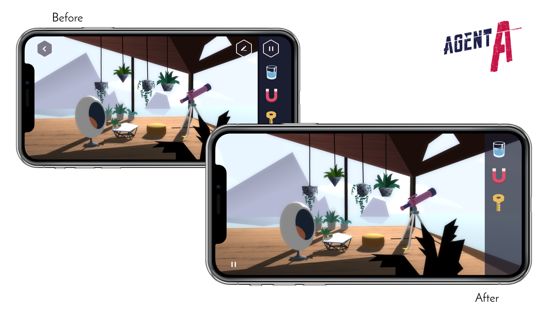
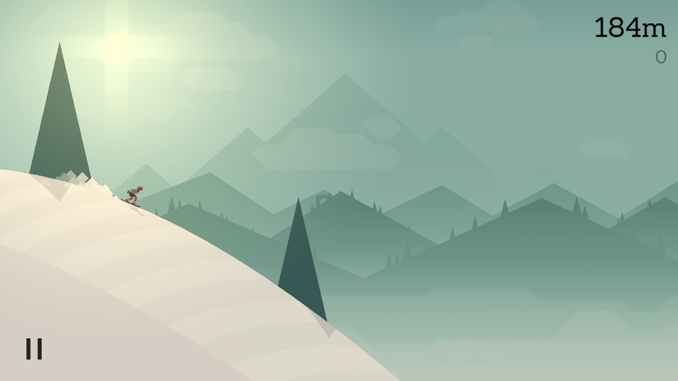
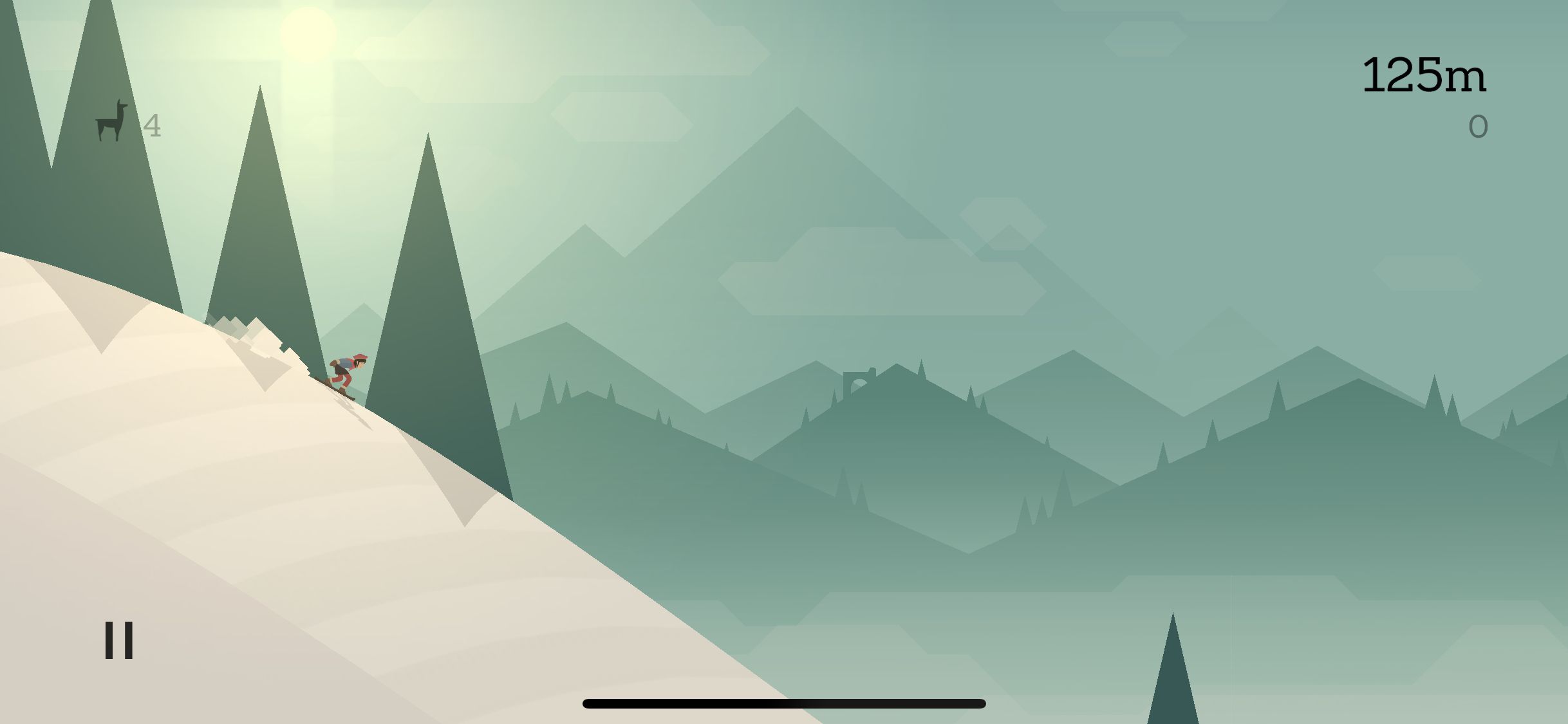
The heart of the iPhone X's pitch is third-party apps. From augmented reality features to the TrueDepth sensor, the new features are meant to stir creativity and action in the developer community, bringing innovative new app experiences to iPhone X users. But even as Apple gives developers new toys to play with, it also has to make sure it doesn't break their old ones.

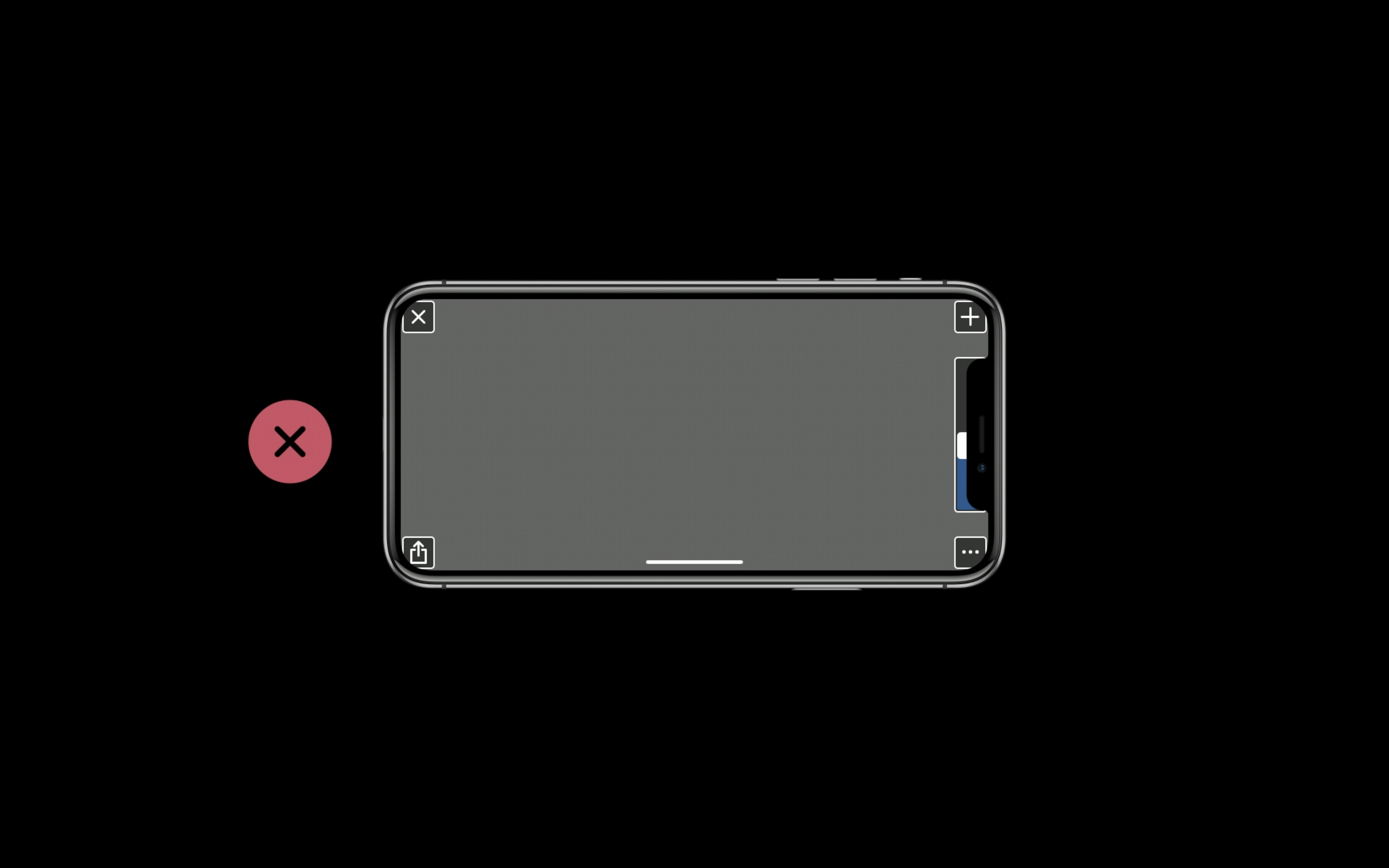
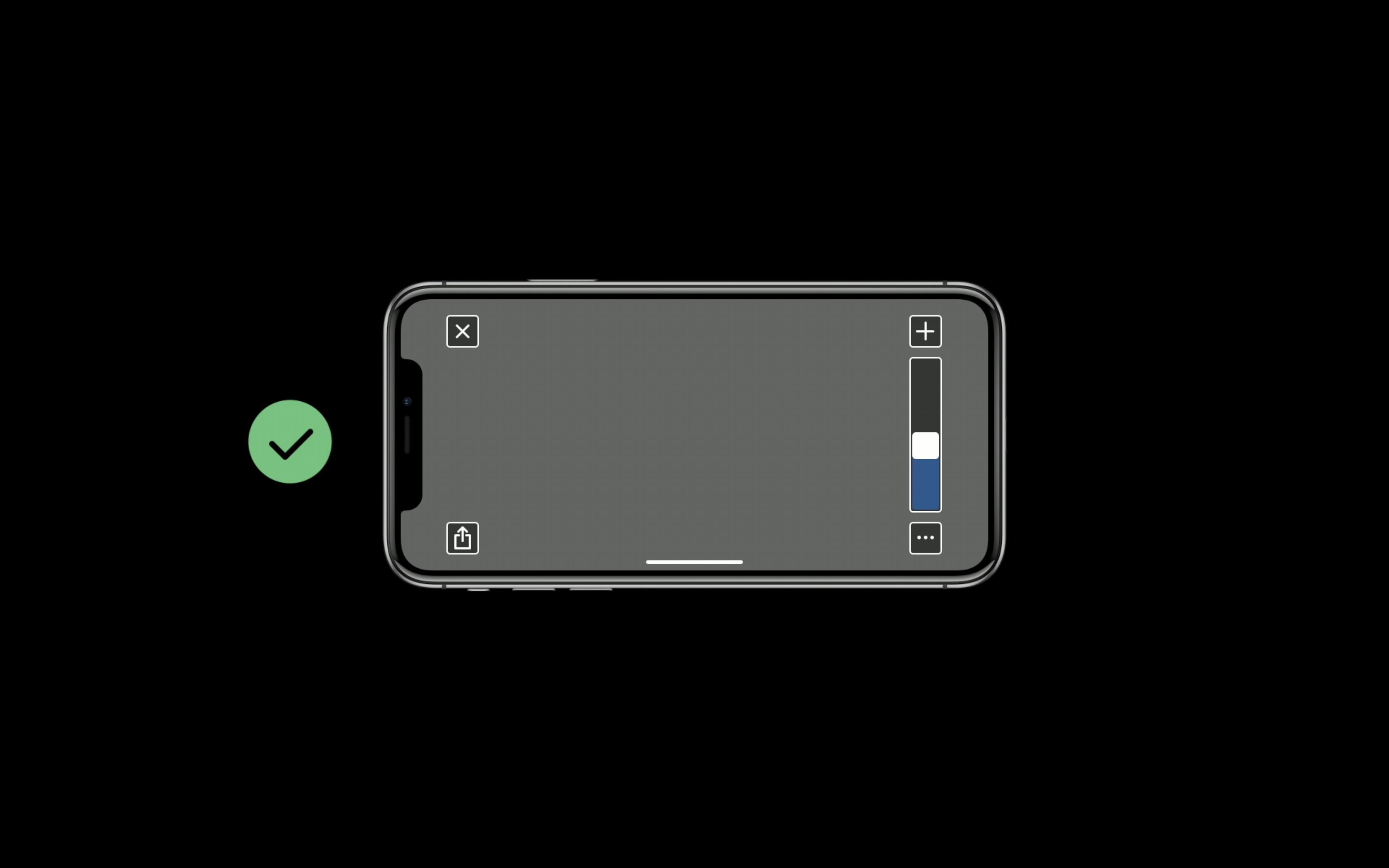
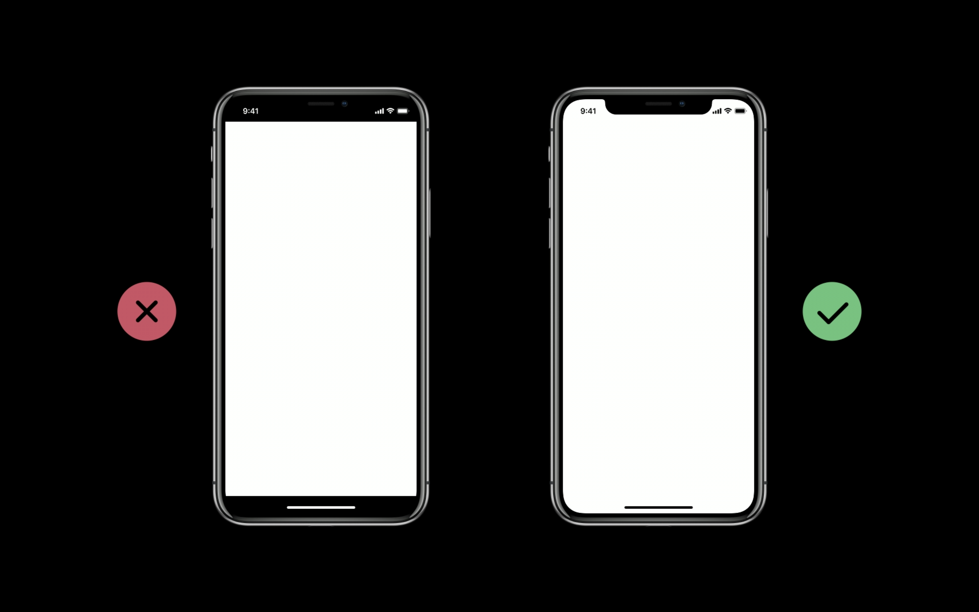
The iPhone X is the most significant change to the iPhone in several years. It has a higher resolution and a different screen shape. It disposes of the home button and adds or changes touch gestures. Every one of those changes could create work for designers and developers... and then there’s the notch. You can expect more phones to do this, not just from Apple. But how do you design around it? How much work is it to adapt an app for it? Is it, as some critics say, bad design?

To find out, I spoke with designers and developers of apps and games for iOS who recently went through the process of updating their apps for the iPhone X. I wanted to ask some of these very questions, but by and large I wanted to hear how the transition to the new phone went for everyone working behind the scenes.

Ars Video


The apps from developers we interviewed

Agent A on the iPhone X.
Basecamp on the iPhone X.
Table of Contents

A bump in resolution

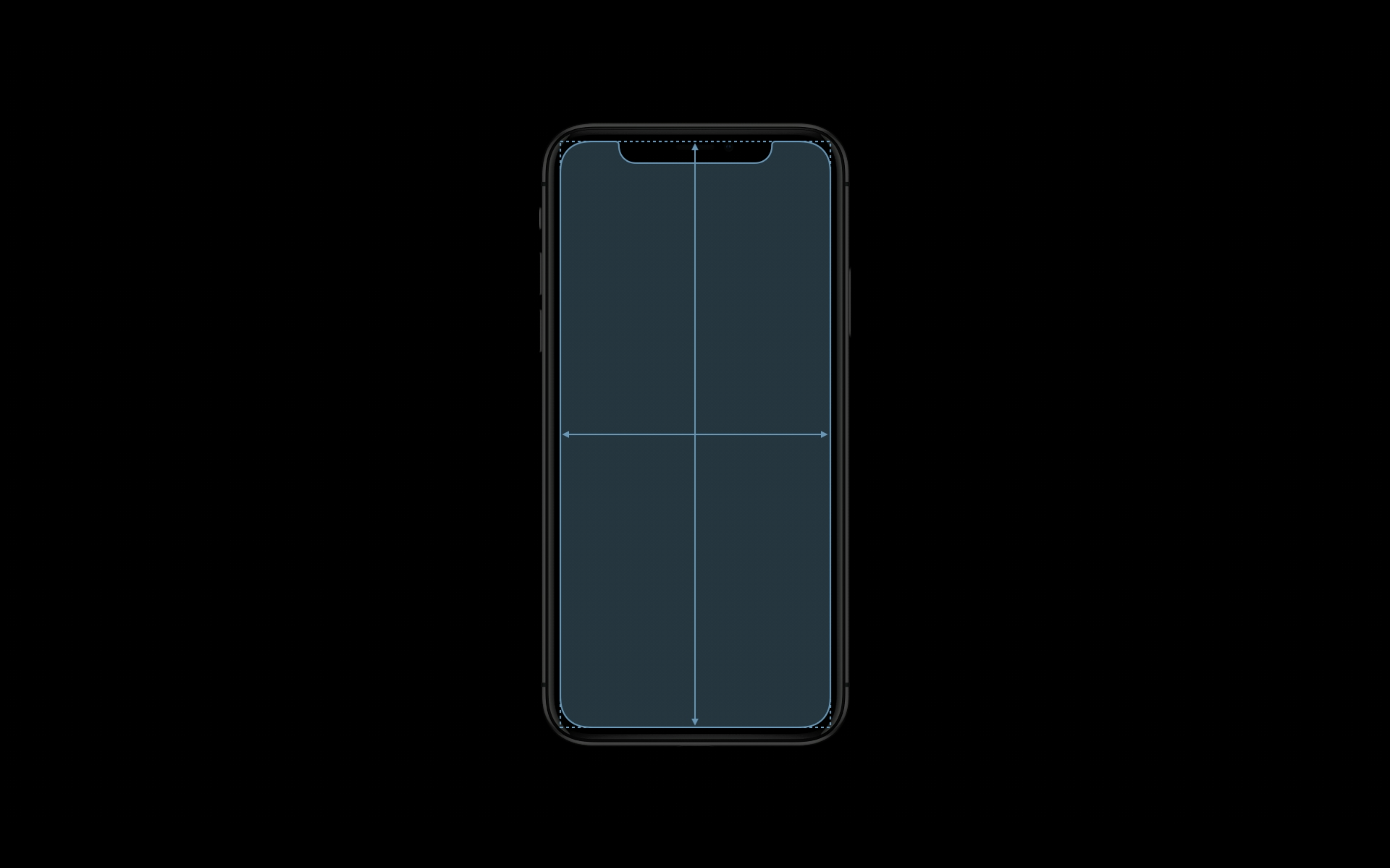
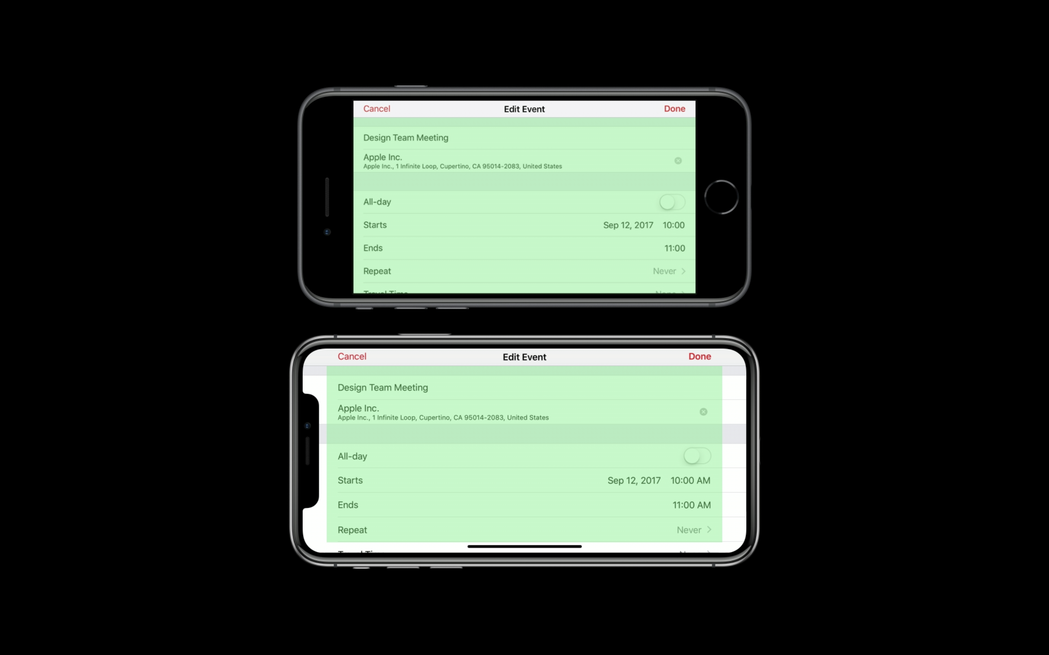
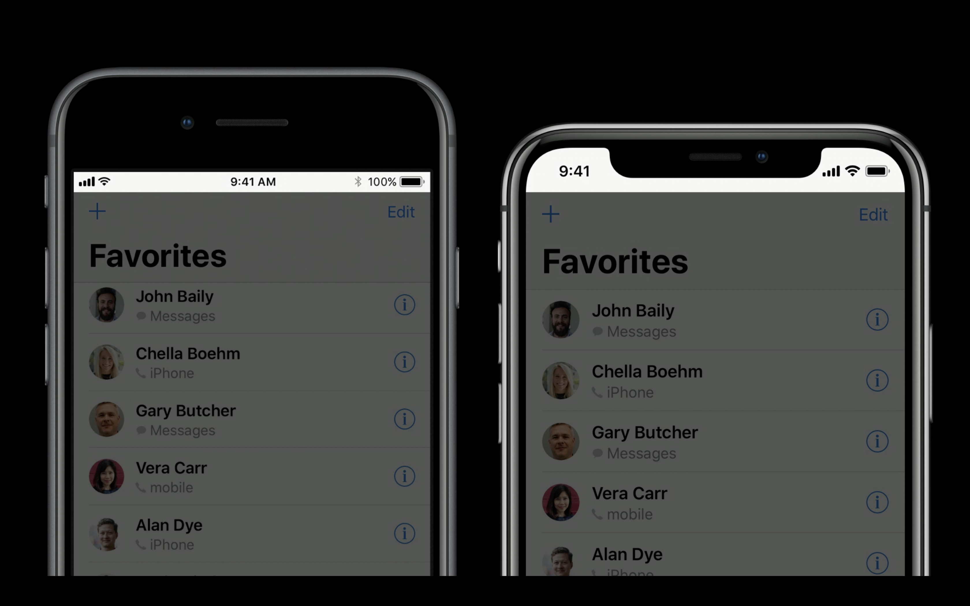
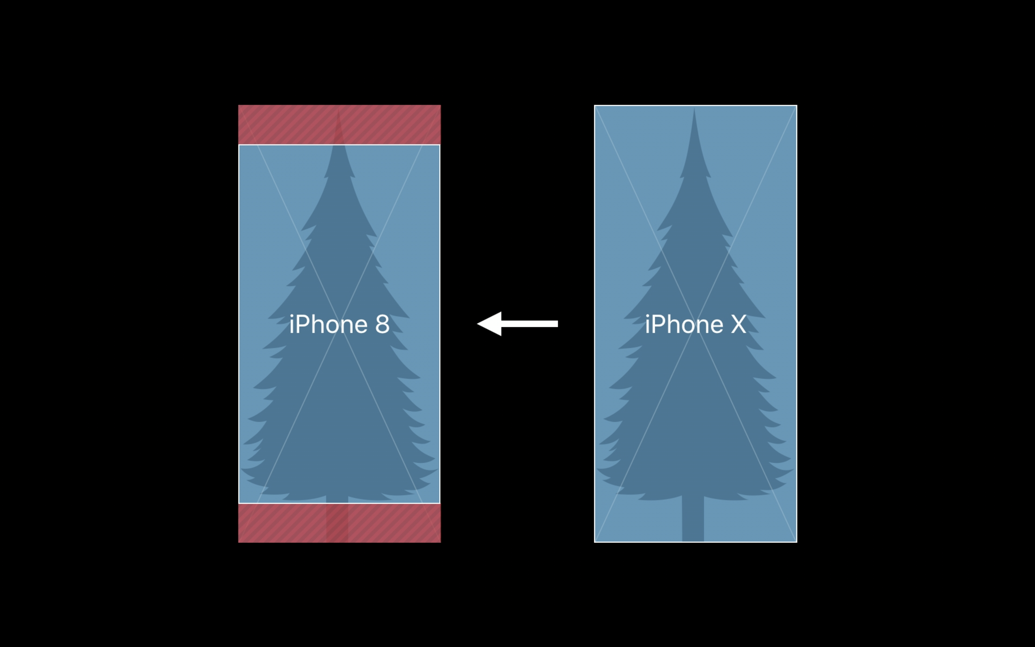
Let's start by looking at the changes and challenges presented by a differently sized and shaped screen and how Apple recommends coping with them. Because iOS runs on devices at a variety of resolutions, Apple and developers on the platform measure their user interfaces in “points” rather than pixels—which is a very common concept in design, anyway. The iPhone X’s display has the same width in points as the iPhone 7 and 8 (375 points), but it is 145 points taller. The fact that the iPhone X shares its width with the regular iPhones and not the Plus models is why it doesn’t support the expanded landscape mode interfaces that you get on the Plus.

The iPhone X's display, with rounded edges and the sensor housing—also called the notch.
The iPhone X's display, with rounded edges and the sensor housing—also called the notch. Credit: Samuel Axon

iOS apps also need to support displaying assets at multiple resolutions to look sharp at each device’s screen resolution; the signifiers @1x, @2x, or @3x are used for the three tiers of resolution for assets. Apple recommends producing assets as PDFs because they are resolution independent. If rasterized images are also needed, they currently must be offered in both @2x or @3x, which previously correlated to the standard-sized modern iPhones with retina displays and the Plus models, respectively. The iPhone X uses @3x.

Every developer I spoke with said they didn't have any trouble with assets looking good on the new screen. Phillippe Levieux, co-founder behind photo editing app infltr, even enjoyed the new approach:

We are using vector assets inside infltr, they are PDFs. We didn't have to make any changes for the iPhone X. This way of working is incredible. You only need one PDF asset that will be compiled into @1x, @2x, @3x.

Yak & Co Art Director Mark White (known for the adventure game Agent A) said his team weathered the asset transition well, and he framed it as a lesson that you should always expect the unexpected and implement accordingly. "We made the conscious effort early on to design things in a very flexible way because you really just can’t predict what kind of resolutions or screen shapes we’ll be running in the future," he said.

But resolution has changed on the iPhone before without major event. The iPhone X makes three additional changes that developers haven't had to contend with before. The corners are rounded, whereas other iPhones have had corners with right angles. There’s the controversial notch—Apple calls it the sensor housing—an intrusion of the camera and other hardware into the middle of the top of the screen. And finally, there's also a new indicator in the UI that is ever present at the bottom of the screen.

The home indicator

iPhone apps used to have the entire screen to themselves most of the time—the only exceptions were the status bar and notifications—but that's no longer the case. They have to cede real estate to the notch at the top and the home indicator at the bottom.

Apple already offered a set of rules and tools called Auto Layout to help iOS developers avoid potential pitfalls with using blocked-off real estate on prior iOS devices. The company describes it this way:

Auto Layout dynamically calculates the size and position of all the views in your view hierarchy, based on constraints placed on those views. For example, you can constrain a button so that it is horizontally centered with an Image view and so that the button’s top edge always remains 8 points below the image’s bottom. If the image view’s size or position changes, the button’s position automatically adjusts to match.

For developers who were already leaning primarily on Auto Layout, the transition to the iPhone X is much simpler than it is for those relying mostly on custom layouts. "My app uses Auto Layout for most of its drawing code," said Galley Foods engineering head Chris Anderson. "So I only had to do minimal work to fit my app to the new dimensions. You recompile with iOS 11, sprinkle some 'if iOS 11' statements to pin your app to the new Apple-provide safe layout guide, and that got me most of the way to the finish line."

Here is a comparison of the safe area in landscape mode on the iPhone 8 and on the iPhone X.
The status bar extends farther down from the top on the iPhone X than it does on previous iPhones, but its size no longer varies.

Apple added a new aspect to Auto Layout called the Safe Area in iOS 11. Based on the Safe Area, developers should confine content and critical UI elements to parts of the screen where they wouldn't be blocked or interfered with by the hardware or system software. For other iPhones, the Safe Area was essentially the entire viewport. On the iPhone X, though, it's more complicated. In portrait mode, the Safe Area blocks off part of the top of the viewpoint and part of the bottom. The top is to accommodate the status bar and the sensor housing, while the bottom gives a wide berth to the home indicator.

The home indicator is a thin bar that is almost always present at the bottom of the screen to indicate to the user that they can swipe up from the bottom to exit the app or reach the multitasking interface. Since this functionality was previously performed by the home button that sat below the screen, you could see the indicator as the new home button in a way. Apple allows developers to enable an auto-hide behavior for the home indicator, but only for viewing full-screen passive content like videos.

Alternatively, developers can activate Edge Protection. This gives the indicator a more subtle appearance, making the user perform two swipes instead of one to get out of the app. This is recommended if a swipe from the bottom is a core part of an app’s functionality, though obviously the best solution is to change that interaction to something else when possible. Apple nevertheless recommends vertically scrollable views extending all the way to the bottom of the display despite the indicator’s presence.

Developers who put UI elements like navigation buttons at the very bottom of the screen might have to move them if they previously rested outside of what is now the Safe Area. Galley Foods' Anderson said that despite his relatively easy transition, this was the biggest problem he encountered in his app:

First, I had a lot of bottoms and actions pinned to the bottom of the screen; all of these required manual intervention (even with Auto Layout) to make sure the indicator line wasn't covering up the button. Second, getting the spacing to look right required some manual tweaking for iPhone X and non-iPhone X layouts. And lastly, I'm still struggling on how to best design around that home indicator. With a bottom pinned button, you can either extend the button color to the bottom or cut it off above the line. Both are somewhat ugly options. The curved edges require you to give lots of spacing above the curve; so there are these extra margins that don't look right.

The more developers stuck to Apple's recommended ways of doing things, the easier the company made the transition for them. Still, Anderson said he felt Apple could have provided better guidance on handling the bottom bar in visually appealing ways. "With giant tab bars and the empty space below the on-screen keyboard, I think Apple themselves haven't figured out what to do," he added.

The notch

At the top of the screen, app developers have to contend with the notch and the status bar. The status bar no longer changes height based on different background tasks, like location services or incoming calls. But it’s taller than the old one in any case. Apps can still hide the status bar and seize that top space, but they have to contend with the rounded corners and of course, the notch.

Most of the developers I spoke with said the notch didn't give them any trouble. "I think the notch encourages the newer iOS 11 styling, with the super tall nav bar and chunky titles," Basecamp designer Tara Mann told Ars. "The notch looks nicer with more negative space around it."

Avoiding the sensor housing also involved adhering to the Safe Area and following Apple's design advice. For apps that rely on Apple's Auto Layout standard practices, the previously mentioned extension of background material takes care of the problem even if navigation buttons are pinned to the edges. But games almost always have custom UIs, so if it's a problem for anyone, it's a problem for game developers and designers. That said, Cash said Alto's Adventure wasn't much affected.

Designing with the new sensor array in mind was simple. Alto's Adventure can render its world at any aspect ratio, and the sensor housing doesn't interfere with gameplay critical elements (such as Alto himself) or obstacles of immediate concern. Once we dialed in our overscan values so the UI could keep itself away from the edges, things were looking good.

By contrast, White said Agent A had to make some changes. In fact, the in-game UI had to be restructured. "In Agent A we use an inventory dock for when players collect items; this inventory was anchored to the edge of the screen along with a few other UI buttons," he explained. "To adhere to the new guidelines, we had to rethink our layouts a bit and ended up simplifying a lot of it in order to comply."

He said the team had been wanting to simplify the interface anyway, so they were glad to have this nudge.

In order to adhere to the new iPhone X guidelines, which include safe zones and margins around the edges for all UI, we needed to rethink our layouts which relied heavily on anchoring to edges. One key improvement was the implementation of a back gesture as opposed to a button. This was something we noticed was very popular in user testing due to its intuitive nature and allowed us to remove the button from the layout.

An added benefit of decluttering Agent A's game UI is that we’ve allowed the beautiful art to stand out without the distraction of intrusive UI buttons. The new iPhone X guidelines challenged us to rethink our UX and as a result has led to a better and more beautiful gaming experience.

Practical consequences aside, I asked every dev we spoke to what they thought of the fact that there's a vocal group of users and critics who mock the notch or even go so far as to call it bad design. Cash said that his studio doesn't share critics' concerns, instead they see deliberate design thinking behind Apple's choice. "Face ID needs a forward facing surface, but it conflicts with the goal of the screen being the entire surface of the device," he said. "Design is compromise, and I think this a fine one."

As a designer, Mann also framed it as a reasonable compromise:

The notch does not bother me at all. Of course the phone would be nicer without it, but its presence does not hinder my use of the X. Transitioning in and out of apps is the only time it is really highlighted, as screens pop out under it when you’re moving around the OS. I'd much rather have Face ID now than have to wait three years for notchless Face ID.

So despite some comment thread and social media angst, by and large the developers and designers Ars heard from all seemed unfazed by the notch.

Dealing with the aspect-ratio change

Apple doesn't want apps to have black bars in letterbox or pillarbox in apps except with certain video content where the aspect ratio obviously can't be changed. But how do apps designed for the iPhone X appear on the iPhone 8, and vice versa?

If developers stick to a very by-the-book use of Auto Layout and the Safe Area with no custom layout at all, apps can be easy to update. In many cases, background material is extended at the top and the bottom, based on the visual style already used there. This automatically puts any buttons that were at the bottom above that extension and clear of the home indicator. This image illustrates what I'm talking about.

When developers have used Apple's standard UI tools, background materials automatically extend to fill the screen.
When developers have used Apple's standard UI tools, background materials automatically extend to fill the screen. Credit: Apple

There are some additional considerations if background graphics are used. Background graphics designed for iPhone 8 will be cropped on the left and right if they’re scaled to fill or on the top if they’re scaled to fit. Apple recommends including background graphics that match the iPhone X's display, though. In this case, the asset will either be cropped at the top and bottom on the iPhone 8, or, worse yet, pillarboxed. That would leave black bars on either side of the app in iPhone 8.

Obviously, that’s not preferable, especially given that the iPhone 8’s LCD display can’t make those bars completely black and flush with the device, and it’s smaller to boot. Apple thus recommends that designers compose images so critical UI elements and visuals only appear in the area that would survive a crop down to iPhone 8.

Agent A on the iPhone X before and after the changes Yak & Co made to make the app compliant with the new design best practices.
Yak & Co took the opportunity of iPhone X necessity to overhaul Agent A's user interface.

For Agent A, White and the rest of the team working on the game had to make some changes to accommodate the taller screen. The game is played in landscape mode, and a few of the scenes in the game didn't fill the iPhone X's whole screen as they were originally framed. "We adjusted about 10 of our scenes to stretch out and fill the space that the new resolution created," he said. Fortunately, "about 95 percent of Agent A is 3D with a lot of 3D disguised in a 2D style," so White said it was only a 30-minute jump that just involved scaling a few meshes.

Let's compare aspect ratios. First, we have Basecamp in the iPhone 7's aspect ratio.
Basecamp in the iPhone X's aspect ratio.
Alto's Adventure in the iPhone 7's aspect ratio.
Alto's Adventure in the iPhone X's aspect ratio.

Snowman accidentally broke Alto's Adventure on older devices in the transition, but the problem was more complicated than just putting UI elements in the wrong places. As Cash explained:

The root issue was an incorrect overscan value being calculated on 32-bit devices. Alto's Adventure uses Unity, so we have to bridge values from Objective-C to C# when using UIKit. The -[UIView safeAreaInsets] message returns a UIEdgeInsets structure. This structure is defined in UIKit as 4 `CGFloat`s. `CGFloat`s are `float` on 32-bit devices but `double` on 64-bit devices. The equivalent C# structure was always expecting `double`. Oops!

The team quickly fixed the issue in an update.

OLED and HDR

Generally, there's not much developers or designers have to do to make their apps look good on the OLED display. I felt that Alto's Adventure looked noticeably more stunning on the iPhone X than it does on the iPhone 7 or 8, so I asked Cash what his team did to make that happen. He credited the edge-to-edge screen and improved contrast with elevating the game's visuals. "We didn’t adjust any art when preparing the iPhone X update," he said, adding that the Alto's Adventure team is still working on supporting a wide color gamut.

When I asked Mann whether she believes OLED offers new approaches or consequences to app designers, she alluded to the screen's blacks and contrast ratio and what that would mean for dark themes. "I think it could lead to some cool theming," she said. "We don’t currently have a dark theme in our app, but I’m guessing a lot of apps with dark themes will make them darker, using purer blacks to take advantage of OLED."

How Apple prepared developers and designers

Typically, Apple briefs developers and designers about important new considerations at its Worldwide Developers Conference (WWDC) in the summer. And Apple did introduce some concepts that would be important for the iPhone X later, like the Safe Area. This year, the company also released video tutorials online when the iPhone X was released to get into even more detail.

Mann said she and the rest of the Basecamp team benefited from other resources Apple provided, too:

Aside from the Keynote, Apple has a nice set of design assets available to download; these include vectorized versions of all the iOS UI elements. We were able to create high fidelity mock ups of designs on the iPhone X even before it launched. There is of course the simulator in Xcode, which also lets you run your app on an iPhone X, but as a designer it was nice to actually start laying out our UI on an X, just to get in that taller mindset.

The simulator she mentioned is key. Xcode, the IDE iOS app developers generally use to build their apps, allows previewing in a virtual iPhone that appears as a window on a Mac desktop. It can be rotated between portrait and landscape, and it actually shows a black cut-in where the sensor housing would be on a physical device. Phillippe Levieux said the simulator was "great" and that he felt prepared by the documentation and videos.

"I wished Apple was giving us a bit more clarity on when GM version of iOS would become available and when we would be allowed to submit," he added. "For example, infltr is taking full advantage of the True Depth camera. API to access the TrueDepth camera only became available in iOS 11.1." Uncertainty about the schedule made some aspects of the iPhone X update "quite stressful" for the infltr team.

Conclusion

The iPhone X could have easily been one of the roughest transitions for app developers, but it seems that Apple did a good job preparing them for it. Elegant solutions and important groundwork were laid at WWDC and in iOS 11, and that left only a little to be figured out when the phone itself was revealed and came to market.

Every developer and designer who agreed to be interviewed by Ars said they were fine with the notch. And in looking at their apps and others on the App Store, it seems that it's the home indicator, not the notch, causing the most pain. The gesture that the home indicator supports is essentially the same as the one that brings up Control Center on other iPhones, so it's not clear why Apple felt the need to add that indicator now.

That curious design choice aside, it seems like we won't have to wait long for competent developers to update their apps for iPhone X—as long as they didn't get too creative with custom layouts. As for the notch, this won't be the last phone with that compromise, but that's OK. In the early going, it's turning out not to be the fly in the ointment many feared. It's time to get used to it.

Listing image: Apple

Photo of Samuel Axon
Samuel Axon Senior Editor
Samuel Axon is a senior editor at Ars Technica, where he is the editorial director for tech and gaming coverage. He covers AI, software development, gaming, entertainment, and mixed reality. He has been writing about gaming and technology for nearly two decades at Engadget, PC World, Mashable, Vice, Polygon, Wired, and others. He previously ran a marketing and PR agency in the gaming industry, led editorial for the TV network CBS, and worked on social media marketing strategy for Samsung Mobile at the creative agency SPCSHP. He also is an independent software and game developer for iOS, Windows, and other platforms, and he is a graduate of DePaul University, where he studied interactive media and software development.
269 Comments